Katie Marriner
Data journalist, designer and developer
My goal to inform and empower audiences through clear, engaging visuals and interactive presentations. I am driven by the belief that open access to information is essential for an informed public. This principle guides my approach to developing visuals and tools that uphold the highest standards of accuracy and journalistic ethics.
- Bluesky | Github | Linkedin | Resume
The State of American Housing
D3.js, Svelte, Jupyter Notebooks with iPython
A data dashboard built to show county-level housing trends, enabling users to search for U.S. counties and compare median home prices and inventory levels against national baselines. Designed with modular components using Svelte and JSON data fetching for scalable coverage.
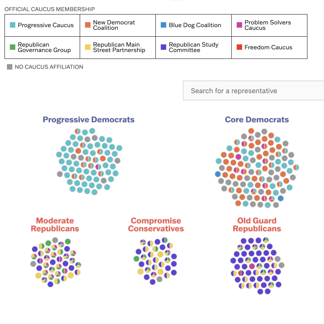
The 8 Types Of Democrats And Republicans In The House
D3.js
I led the design and development of Quiet Caucuses, an interactive for FiveThirtyEight that maps the alignment between House members' caucus affiliations and their 2023 voting behavior. I built a custom interactive using D3.js and JavaScript to reveal patterns in a complex dataset, translating vote similarity scores into interpretable data visualization with a responsive layout. The project required close coordination with reporters to iterate on data structure, visual encoding and user flow.
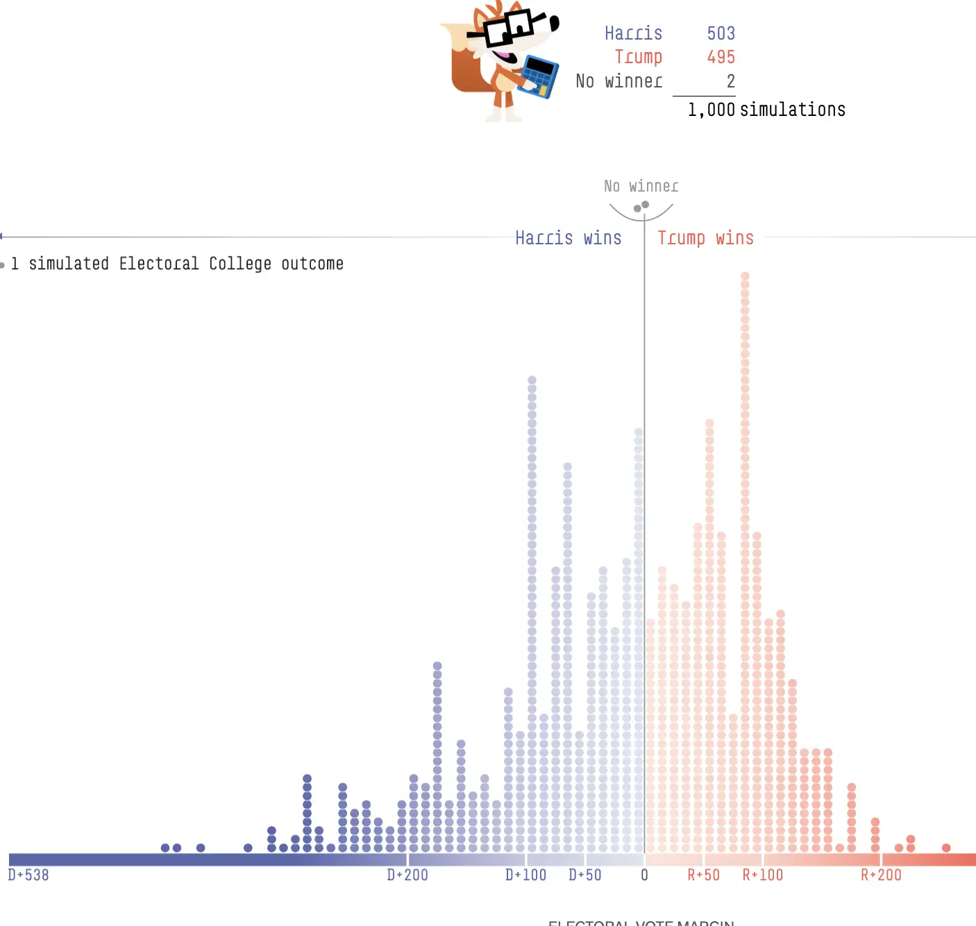
Who Is Favored To Win The 2024 Presidential Election?
D3.js
I led the design of FiveThirtyEight's 2024 election forecast and helped develop the frontend, visualizing polling uncertainty and highlighting the significance of seven swing states. It was viewed 64.6 million times in three months.
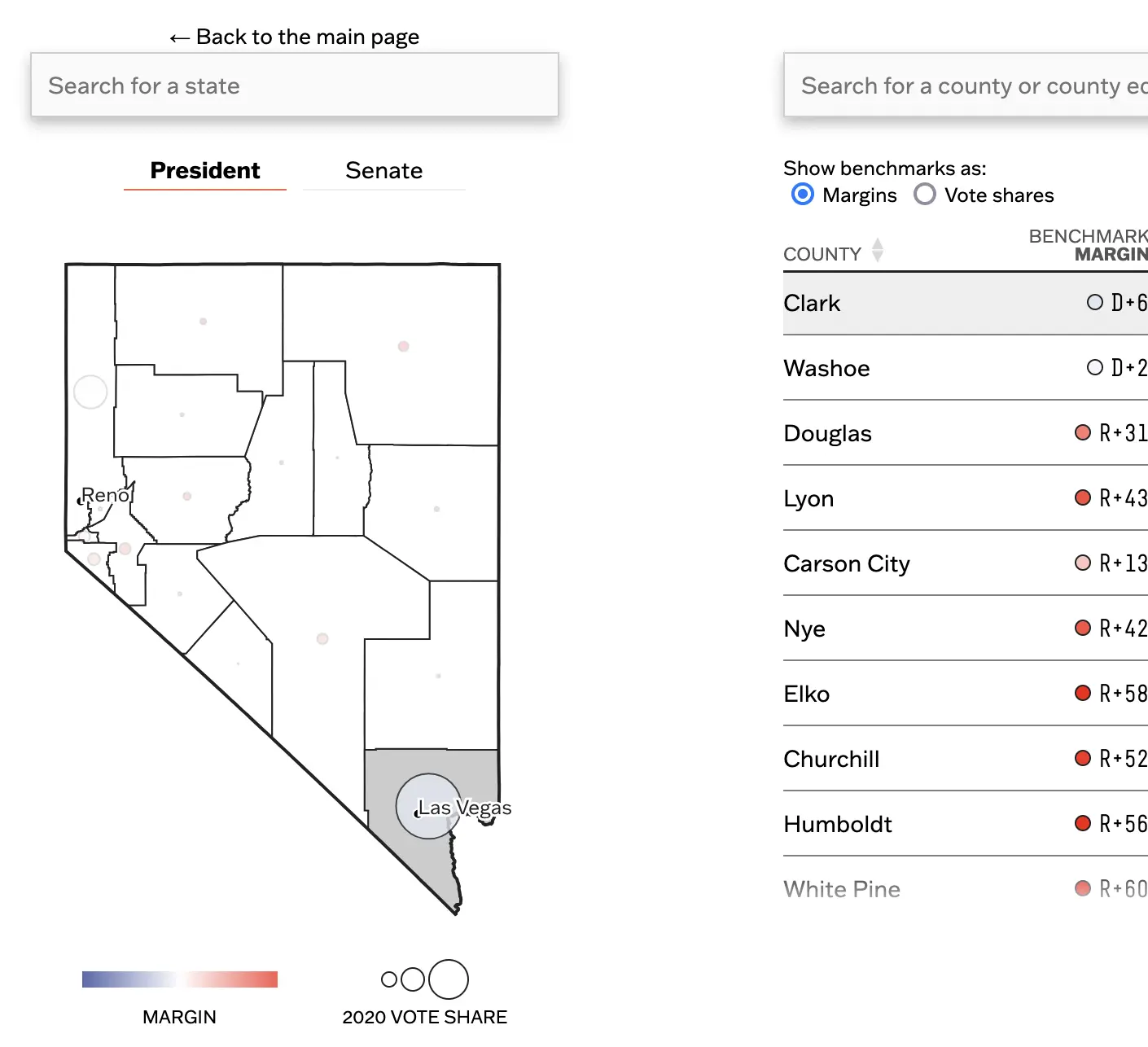
How To Tell Who's On Track To Win On Election Night
D3.js, Python
I built a 50-page interactive combining custom-rendered county-level maps and data tables to guide readers and ABC reporters through live election results. I processed and simplified shapefiles into optimized TopoJSON for each state, then dynamically rendered maps with D3 to minimize load. The interface paired spatial and tabular components to help users interpret partial vote returns in real time. It garnered 648,000 page views in three days.
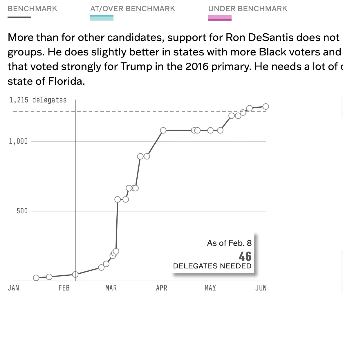
Who's On Track For The GOP Nomination?
D3.js
I designed and developed a three-part interactive for that visualizes the delegate race across the 2024 Republican primaries. The centerpiece was a set of five synchronized D3 line charts with a custom hover system that let users compare candidate trajectories without jitter or overlap. I also condensed a dense delegate calendar and benchmark data into a responsive, scrollable layout to balance clarity with depth.
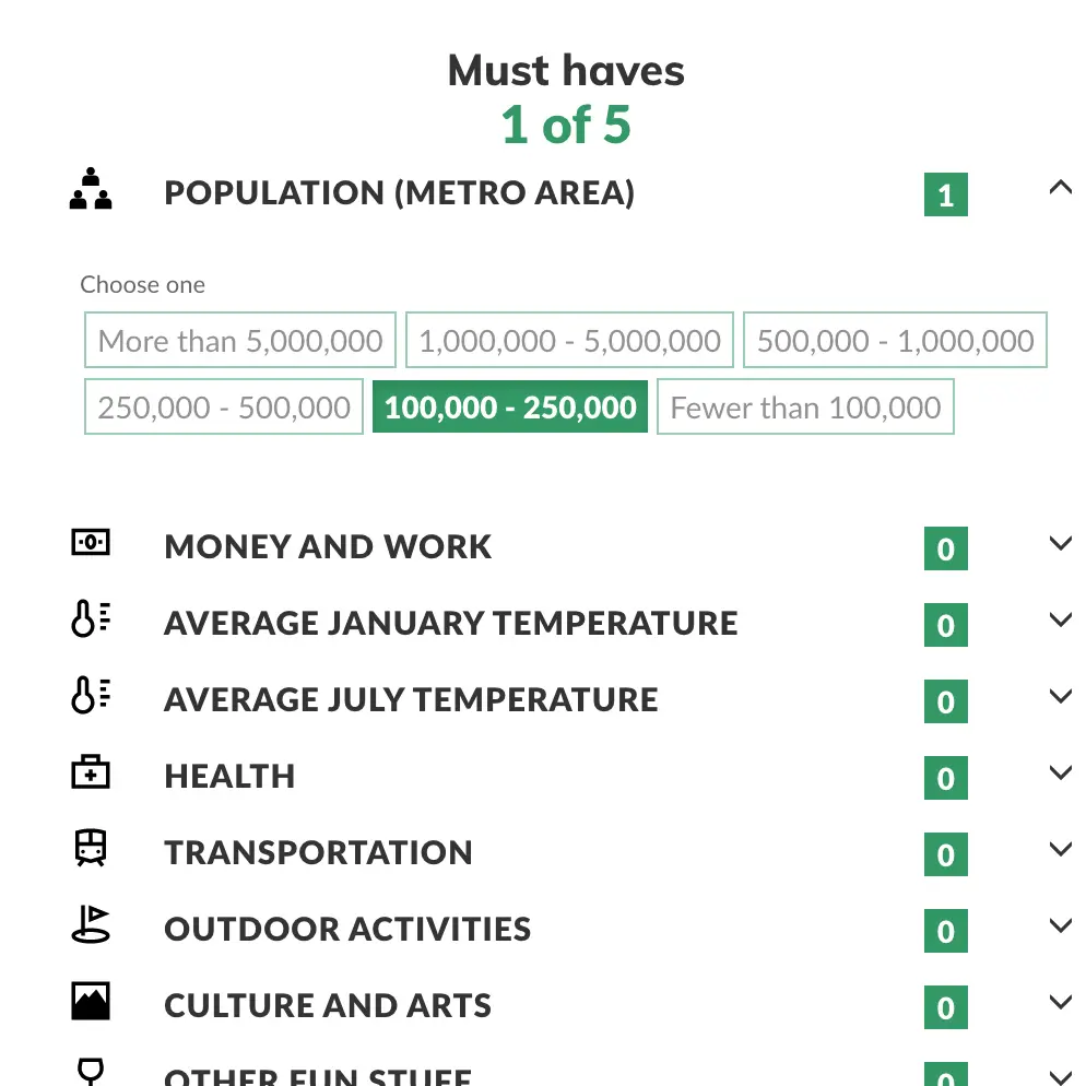
Where should I retire?
Vue.js, D3-geo (command-line interface), Excel
I built an interactive retirement quiz for MarketWatch using Vue.js and JavaScript's Web Workers to deliver a smooth, responsive experience even with a large JSON file. It improved performance by 98%. The tool guided users through a series of questions about lifestyle, climate and cost preferences, then matched them to potential retirement locations based on a weighted scoring algorithm created by myself. I used a Web Worker to handle filtering and ranking logic off the main thread, ensuring fast, fluid updates and maintaining performance.

Annotation Tool
Handlebars.js, PHP, mySQL
I designed and developed the front-end UI, admin interface and template for a tool that lets editors easily annotate images, charts or illustrations on deadline.
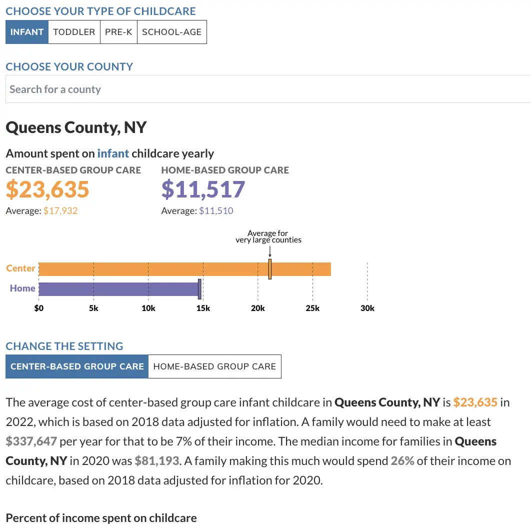
The rising cost of childcare is making life impossible for parents. Use our calculator to track the expense where you live.
D3.js, Svelte, Python, Pandas
Built with Svelte, this interactive lets readers explore childcare costs in their county using data from the National Database of Childcare Prices. Users can input their income to see how local childcare expenses compare to both their household earnings and the county median—making abstract cost burdens tangible at a personal level.
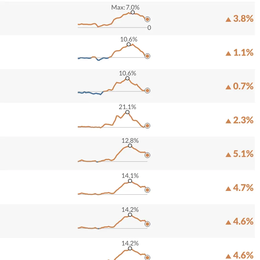
Economic indicator breakdown series
Svelte, D3.js, GitHub Actions, Python
A series of interactives where I breakdown and visualize top-line economic indicators and make its components searchable.
- Florida has the highest inflation in the U.S. Here are some other hot spots.
- The U.S. economy added 209,000 jobs in June. Use our interactive to see a breakdown of these numbers by industry
- Search for the latest PCE inflation trends of almost 400 items
- Search for the latest CPI inflation trends of almost 200 items
- Use MarketWatch's tool to search for the producer price index of almost 600 products
MarketWatch Metrics
A column where I regularly take a deep dive into one data point that is meaningful to the financial world and your money. There are so many metrics that can help us make informed financial decisions. I explain how they are derived and what we can learn from them.
- This little-known metric tells you how a mortgage-rate move impacts your ability to buy a home
- The metric that shows why the world's three biggest economies could be in serious trouble
- Confused about what's causing inflation? This metric shows what's driving the price rise.
- India is now the world's most populous country. But this demographic metric is more important for its economy.
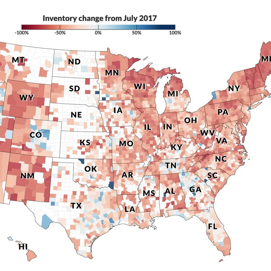
Potential homebuyers may start to feel some relief: Use our interactive to see how housing inventory changed in your county.
D3.js, Svelte, Python, GitHub Actions
I analyzed data on total listings of single-family homes collected by Realtor.com to organize and present data in a personalized way.
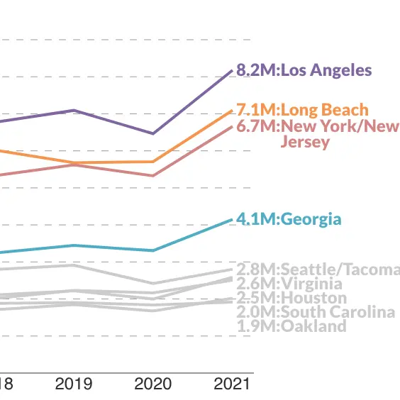
This is how America's booming demand for goods shattered the supply chain.
D3.js, Vue, Google Sheets
By collecting data from each of the nine largest container ports in the U.S., I created a unique dataset that tells the story of how the supply chain is being affected by the changing economy, particularly from the increased demand for goods.
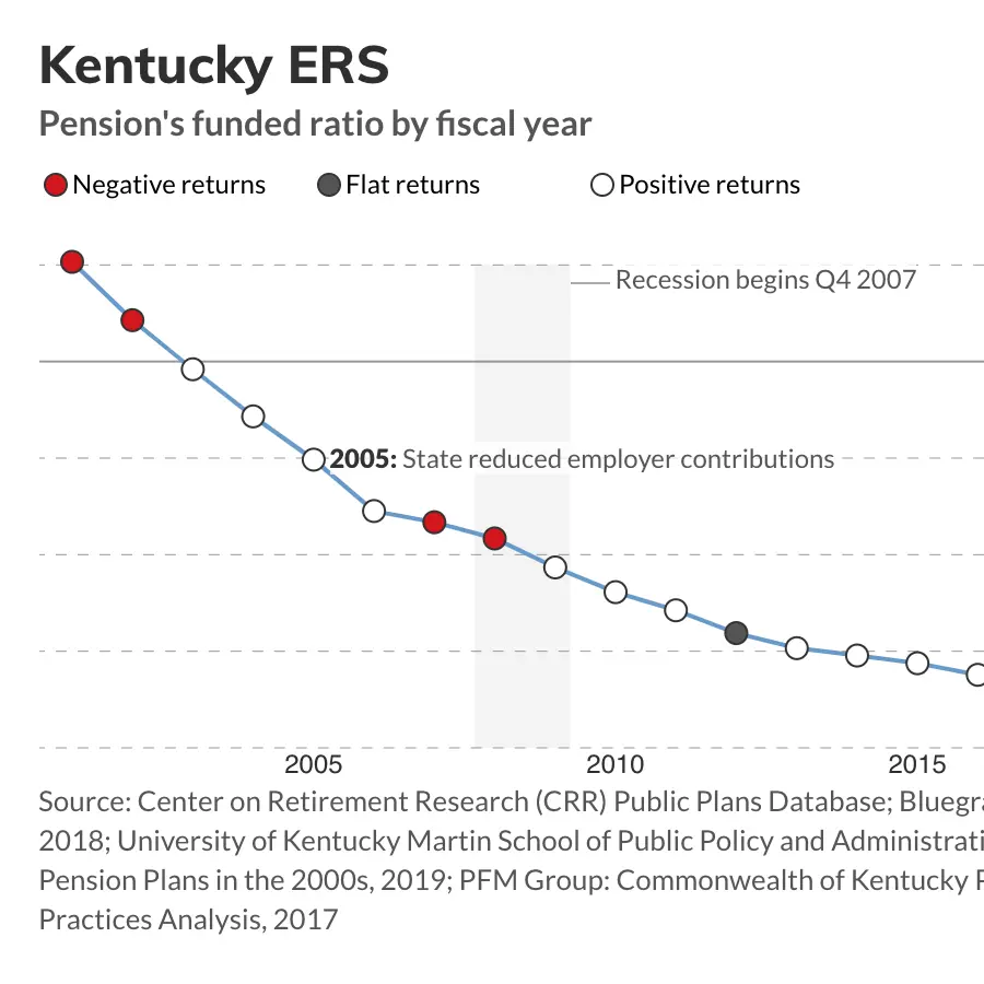
These public pension systems used to have too much money. Now they're in crisis. What happened?
D3.js, Vue, Google Sheets
I analyzed data from over 200 public pension systems, identified outliers in funding ratios and put these data points into context of market conditions and legislation.
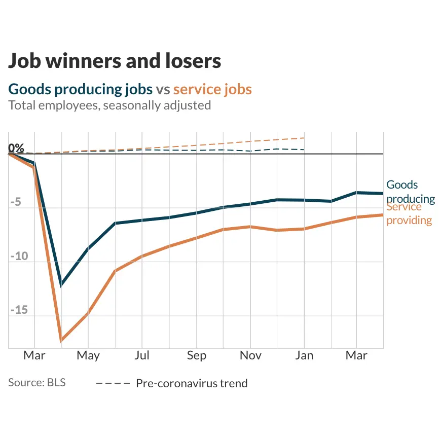
The K-shaped Recovery: The coronavirus pandemic has remade our working lives, and it's been anything but fair.
D3.js, Vue, Google Sheets
ICOs continue to raise money via SEC back door
Python/BeautifulSoup
I searched the SEC's EDGAR database using Python and BeautifulSoup to find mentions of crypto-related words in Form D filings with the SEC, which is where some companies are initiating ICOs
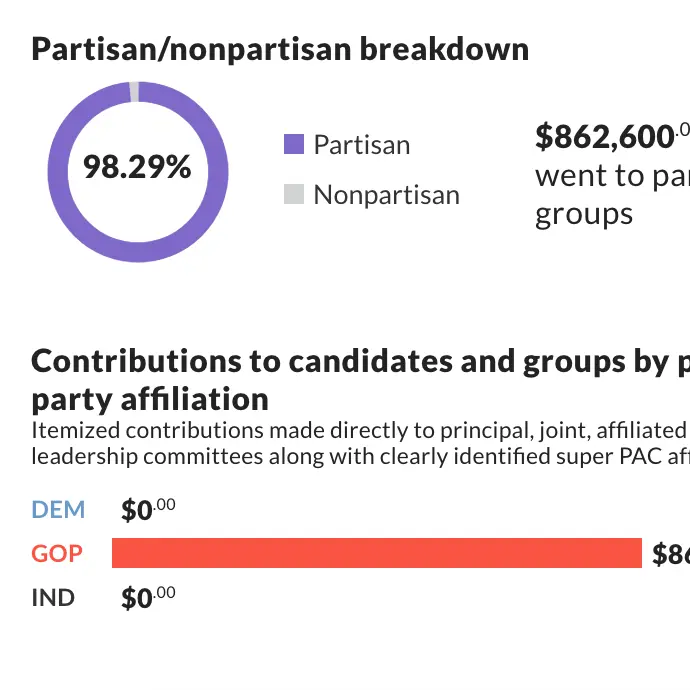
What S&P 500 CEOs spent on midterms
Python/pandas, Excel, OpenRefine, Vue.js
Looking at FEC data, I identified CEOs of S&P 500 companies for the 2018 reporting cycle using Python to fetch and format the data, OpenRefine to standardize last names and employers and Excel to analyze the data. I built the interactive with Vue.js.
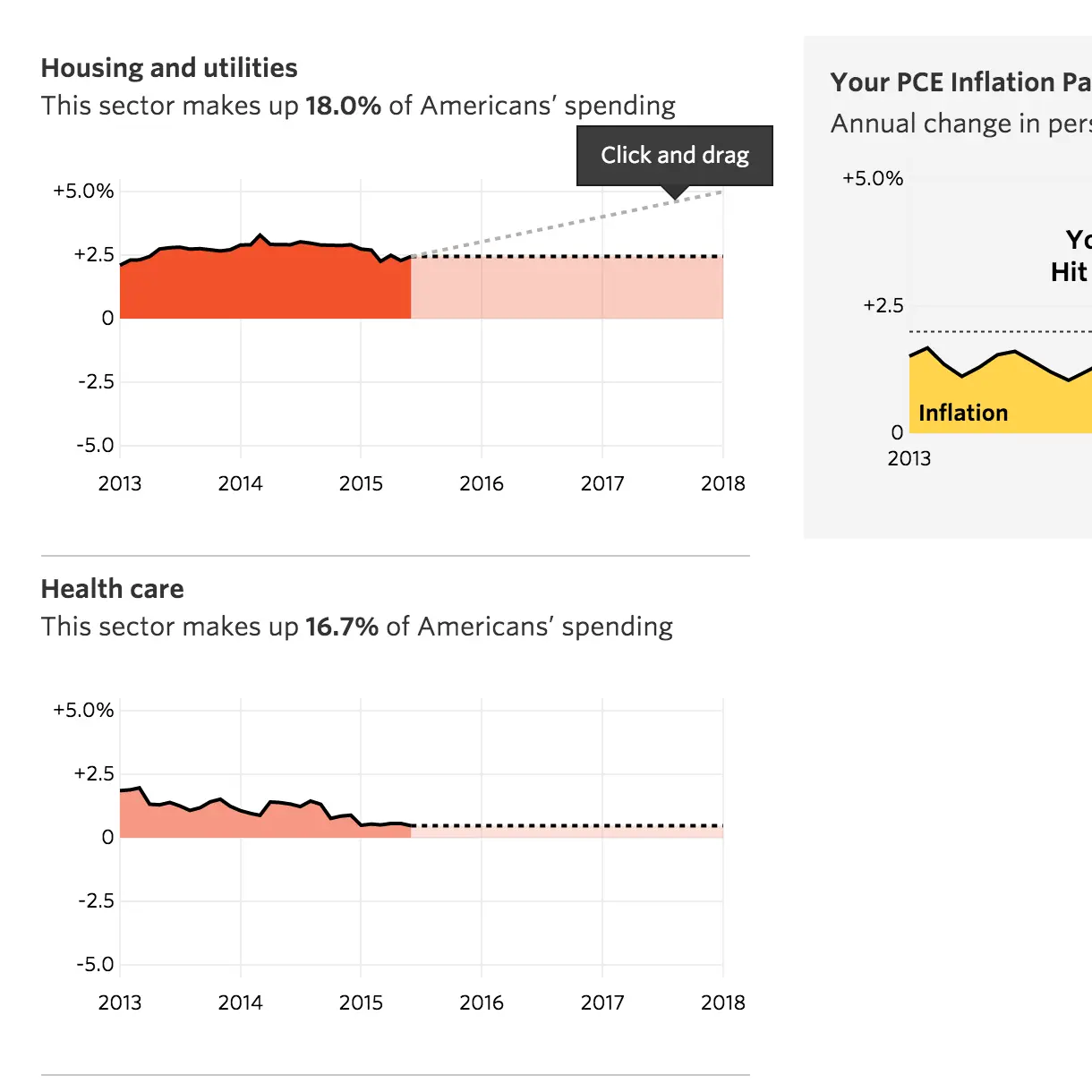
Beat the Fed
Python, D3.js, JavaScript
I wrote a script that calculated the make-up of PCE inflation and could be run every month after the Commerce Department's release of the figures. I also contributed to the frontend design and development of the tool.
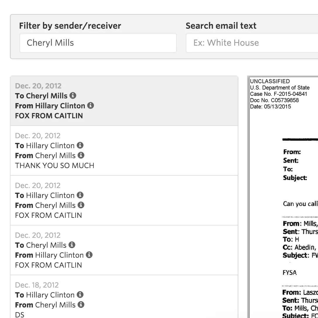
Search Hillary Clinton's emails
Bootstrap Tables, Handlebars.js
The State Department released Hillary Clinton's emails from the time when she was secretary of state on a monthly schedule. I implemented Bootstrap Tables and server-side pagination to improve load time. Features include the ability to search by certain senders/recipients and popular search terms to guide users on what to search for.